While researching my current favorite subject "Information Visualization", I came across an innovative product called the "
Visual Thesaurus".

It is an interactive dictionary and thesaurus which creates a visual map of a word and all the meanings, synonyms and antonym of it. The meanings are color coded to categorize them as nouns, adjectives, verbs or adverbs. You can roll your mouse over a word to learn its meaning or listen to the pronunciation of it. I signed up for the online version of it so it loads a small Java applet and the interface is beautiful and functional. Every time you click on a new node, the graphic smoothly re-adjusts by positioning the new item in the center of the screen and new relations are displayed. The image optimizes itself to make the diagram as much readable as possible by avoiding test and graphic element collusions. That algorithm should be interesting.
I strongly believe we will see this kind of data representation more and more as there is clearly a need for a next generation method of presenting information. There is too much information out there but not many technologies that will enable us to make more sense of it. We need to better organize, classify and relate data by representing it visually better to allow us to get to it faster and to be able to make more sense of it.
I just typed "Visual" in google and it returned 972.000.000 results. I do not know how this information is useful to anybody and what that means. I believe Google should stop displaying the result counters. To me it brings no value. I believe most people just browse the first few pages or re-submit their search to narrow down the results. Having said that Google is doing a terrific job of bringing the most relevant entries together with clearly marked sponsored results so I never have any problems with finding information as long as I am specific enough in my queries.
Well.. My point is it is time they take it to the next level. Wouldn't it be terrific if they had an optional 3d graphical results page where they aggregate the information, categorize it and display it as graphically associated objects so that you can navigate by clicking on these objects and drill down on your queries and then switch to text mode when needed? I am sure with all the genius people on board, they should be considering this kind of technology.
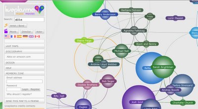
While thinking about these I came across an other fine example;
Liveplasma. A different kind of search service where the searched item is displayed in the middle of the map with related items around it. The proximity of the items provide information on the relationship. The larger the ring around the name, the more important it is. Plus it is all color coded so you can immediately understand the category of the items. You can click on an other item on the map and that becomes the focal point and the map is re-drawn.
I believe this kind of information representation adds great value. Human brain is much more receptive to graphical information. Plus in most cases the information is multi-dimentional meaning you need to convey multiple types of information which you can not do by character based systems. So you need at least color coding to represent the categorization. We need to start treating information as objects with properties and relationships just like the Object-Oriented Theory of Computer Science which I believe is one of the best inventions of our age.
I keep updating this article as it seems there are more examples of this out there. This one is from
Cnet (Click on any news and it is on the right lower side). Under the news section they have what they called the "Big Picture". Great name. This is exactly what this technology is for. To give you the big picture. It seems they actually licensed the graphic engine from liveplasma.com which was referenced above and feed the IT industry news through it. So when you look up a news you see all the related news and other supplementary information about this. Check out the example that is in the picture below:

The black boxes are related stories, the green boxes are related topics and the red boxes are related companies. You can click on any other box and it moves into focus and the diagram is redrawn in a very smooth way and the new relationships are established. When you move your mouse on a box it drops down a small panel like a tool tip that gives you the choices to get more information on the topic. I wonder the algorithm behind the process that establishes the relationships. As opposed top the "Visual Thesaurus" example where these relations has to be defined by humans, this CNet example should be using an automated process to create the relations based on keywords.
Cnet also has an other visual tool under "What is hot" category. This time they use space-filling visualization method. This works by dividing the display area into a nested sequence of rectangles whose areas correspond to an attribute of the data set, effectively combining aspects of a Venn diagram and a pie chart. Originally designed to visualize files on a hard drive, this technology have been applied to a wide variety of domains ranging from financial analysis to sports reporting. There should be complex algorithms behind this kind of diagramming to reduce the occurrence of high aspect ratio rectangles and to maintain ordering.


